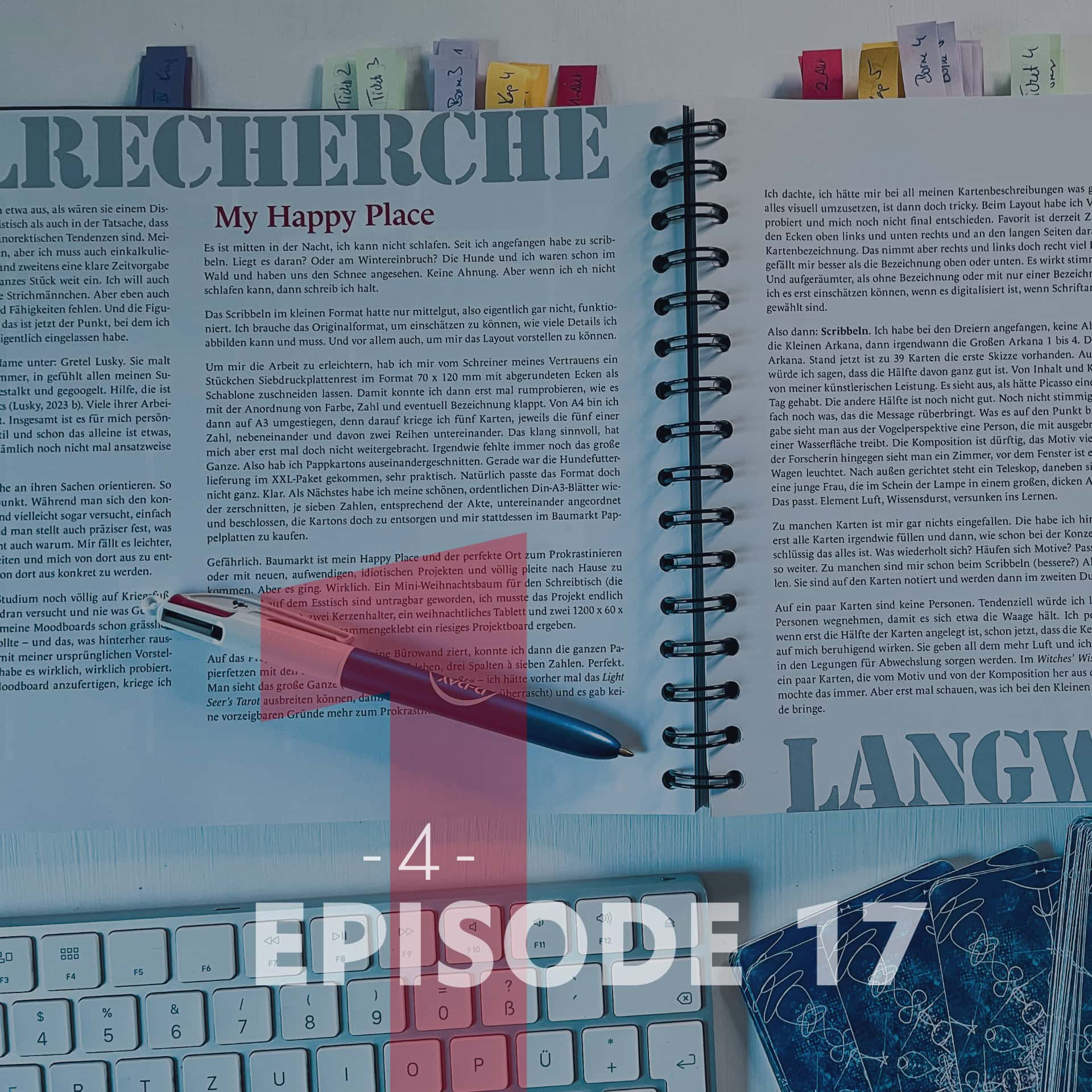
Believe it or not: In this episode I’ll actually start scribbling and drafting the cards. So let’s dive into some scribble philosophy, take a look at the very first embarrassing sketches and see where I stand according to the official Thesis Checklist … Watch the video to see the fotos of the old sketches. 🙂
My Happy Place
It’s the middle of the night and I can’t sleep. Ever since I started scribbling. Is that the reason? Or the sudden onset of winter? The dogs and I already went into the woods to look at the snow. No idea. But if I can’t sleep anyway, I might as well write.
Scribbling in the small format only worked moderately well, meaning, not at all, actually. I need the original format to judge how many details I can and must include. And above all, to actually visualize the layout.
To make things easier, I had my trusted carpenter cut a scrap piece of plywood to 70 x 120 mm with rounded corners to use as a template. That allowed me to mess around with the placement of the suit, number, and maybe the title. From A4, I then upgraded to A3, because I can fit five cards on it, the five cards of one number, side by side, in two rows. Sounded practical, but it didn’t really get me anywhere at first. Somehow, the big picture was still missing. So I cut up some cardboard boxes. The dog food delivery in its XXL parcel had just arrived, very handy. Obviously, the format didn’t quite fit. Of course not. Next, I cut up my nice, neat A3 sheets again, arranged seven numbers vertically according to the acts, and decided to toss the cardboard after all and buy poplar plywood panels at the DIY store instead.
Dangerous. DIY store is my happy place and the absolute perfect spot to procrastinate, or to come home with new, elaborate, idiotic projects and completely broke. But I managed. Really. A mini Christmas tree for my desk (the craft piles on the dining table had become unbearable, I finally had to move the project into the atelier), two candle holders, a festive tray, and two 1200 x 600 x 4 mm poplar panels that, taped together, make one massive project board.
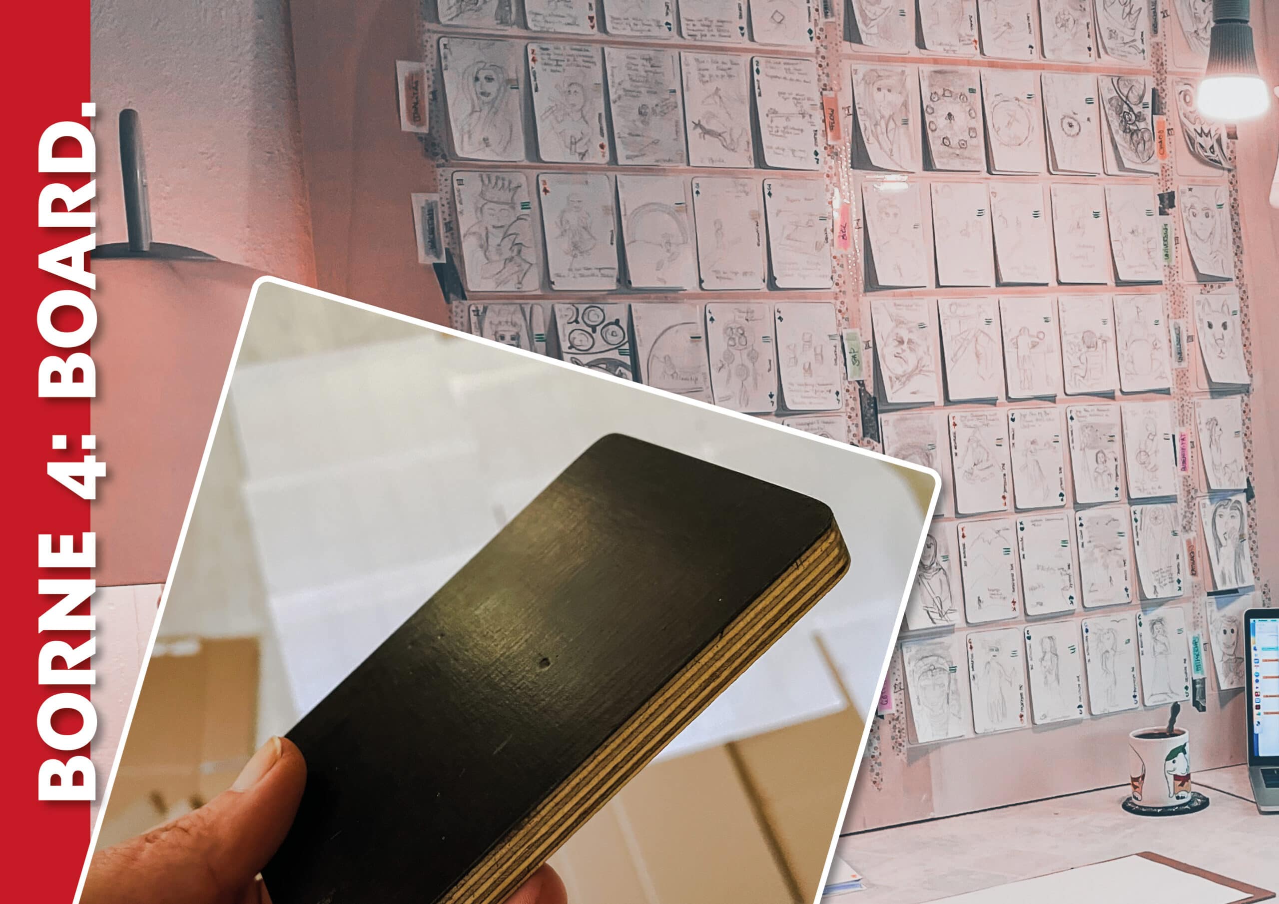
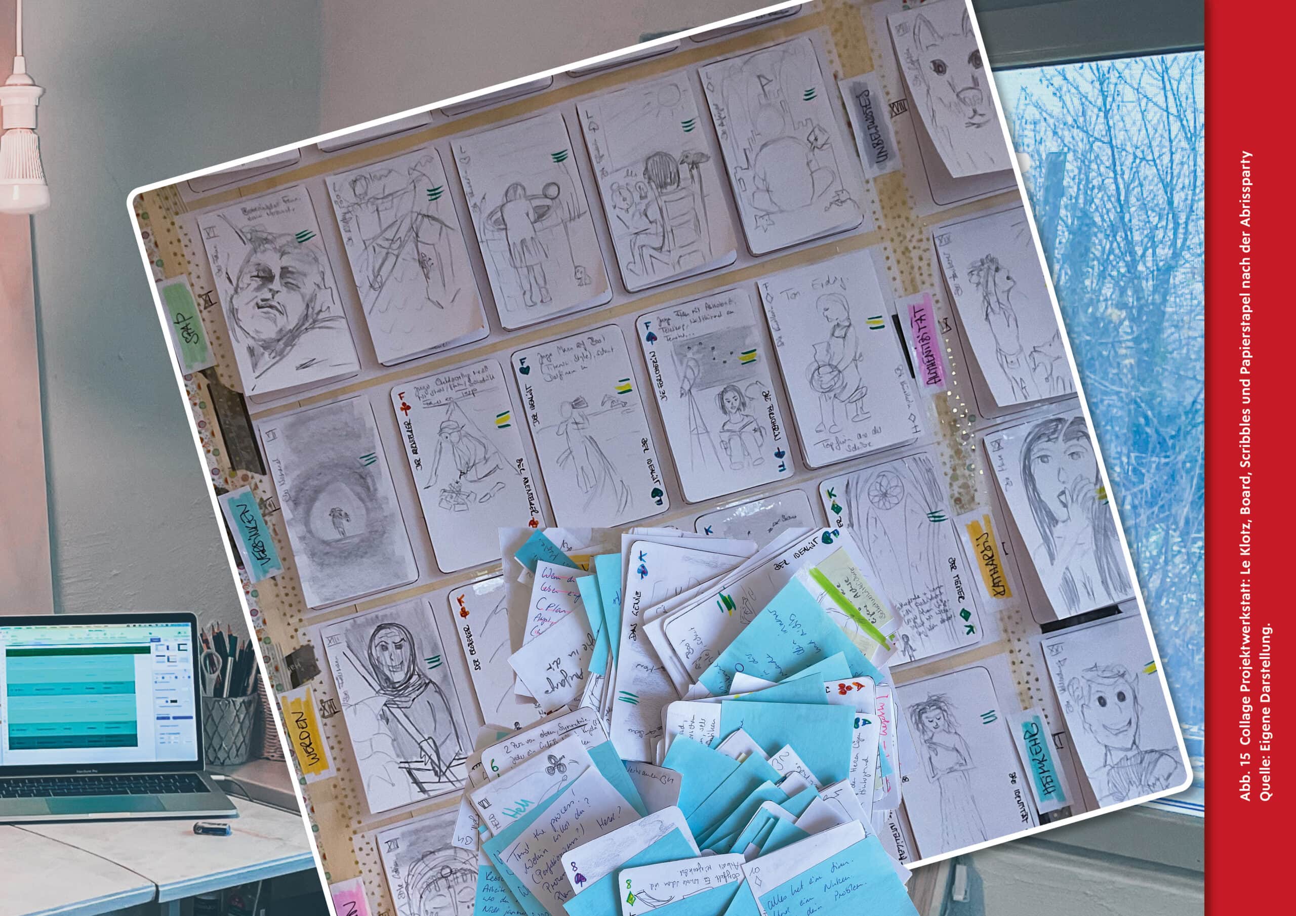
Onto this project board, which now adorns my office wall, I could now stick all the paper scraps with the card silhouettes, three columns of seven numbers each. Perfect. You can see the big picture (emphasis on »big« – I should have laid out the Light Seer’s Tarot before, then I wouldn’t have been so surprised) and there were no more presentable excuses to procrastinate.
Here’s the video:
I thought I had really thought things through with all my card descriptions. But translating all that visually is actually pretty tricky. I tried out various layouts and haven’t made a final decision yet. My current favourite is putting the number and suit in the top left and bottom right corners, with the card title running along the long edges toward them. It does eat up quite a bit of space on the left and right, though. But I like it better than having the title at the top or bottom. It looks more cohesive, more orderly. And tidier than having no title or just one. I won’t be able to finally judge it until it’s digitized and the font and size are selected.
Right then: Scribbling. I started with the Threes, no idea why. First the Minor Arcana, then eventually the Major Arcana 1 to 4. Then back to the Minor Arcana. As of right now, there are initial sketches for 39 cards. Gut feeling says half of them are pretty good. In terms of content and composition, not my artistic prowess. It looks like Picasso had a really bad day. The other half isn’t good yet. Not cohesive yet. Or there’s just something missing to get the message across. Something to hit the nail on the head. For Devotion, you get a bird’s-eye view of a person floating on the water with arms spread. The composition is poor, the motif way too generic. For The Researcher, on the other hand, you see a room; outside the window, it’s night, the Big Dipper is shining. A telescope points outward, and next to it, sitting on the floor by the light of a lamp, is a young woman reading a massive, thick astrology book. That fits. Element Air, thirst for knowledge, absorbed in learning.
For some cards, I drew a complete blank. I put those on the back burner. I want to roughly fill all the cards first and then – just like during the concept phase – see how logical it all is. What repeats? Are there too many similar motifs? Does it fit the story? And so on. For some, (better?) alternatives already occurred to me while I was sketching. They are jotted down on the cards and will be implemented in the second pass.
On a few of the cards, there are no people . I’m leaning toward removing people from a few more so that it roughly balances out. Personally, even with only half the cards drafted, I can already tell that the people-free cards have a calming effect on me. They give the whole thing more room to breathe, and I think they will also provide variety in the readings. In the Witches’ Wisdom Tarot, there are also a few cards that break ranks in terms of motif and composition. I always liked that. But first, let’s see what else I can manage with the Minor Arcana.
The Major Arcana are even more fun! I’d love to do dozens of drafts for each card here. I’m not just designing the card, I’m designing my absurd creatures. Unlike the Minor Arcana, they are supposed to be much more ornate. With their costumes, their attributes, matching details from amulets to sigil rings. Right now, the Magician in his wizard hat looks like Schmendrick the Magician. It wasn’t intentional and I had pictured him older … more the Gandalf type. The Mermaid is a total fail and looks like she partied hard and barely slept. I really like the Queen, and I also managed to temporarily solve the problem of having to show her interacting with the Fool while simultaneously making her look at the viewer: You see the Fool with his jester’s hat and bells from behind, the Queen is central in the image, hugging him maternally, while the viewer basically looks over the Fool’s shoulder, directly into the Queen’s kind face. The King sits majestically and securely on his throne. I had him pictured in a Louis XIV style, but while sketching, it hit me that there are entirely different kinds of kings. The ones with animal pelts on their shoulders. And that’s as far as I’ve gotten on that front.
I love this part of the work. I love the project board and I love watching it fill up. I love that I can truly see the entire project at a single glance. And most of all, I love this analog component of my digital work – with all the scribbling and snipping, it feels almost like a craft. I could keep working like this forever. When I grow up, I want to be a card painter!
Right. It is now the middle-middle of the night, and I am wide awake. The relaxation tea that tastes like lavender sachets apparently hasn’t kicked in yet. I’d love to scribble, but I know nothing decent would come of it right now. Luckily, I got my long-loaned Season 1 of Game of Thrones back a few days ago, which is exactly what I need right now. Plenty of king and costume inspiration there. And the weather matches. It’s cold AF. Winter is definitely coming.
SCRIBBLES
The Second Act??
I’m still scribbling. Progress is moderate. Some cards are still yawning voids, for others I’ve already made the third, fourth, or fifth draft. I glue them on top of the older drafts so I can flip through them.
It has dawned on me that the project is insanely complex, also at the scribble stage. First, I have to figure out what I actually want to depict. For instance, »Practice«. What does that mean? Then the question is how I want to depict it. A person practicing something (what?); a result (which one?) that surely required practice; something much more abstract, like an object (which one?) that you associate with practice. How abstract does the depiction need to be – and how abstract can it be? Once the motif is set, say a pole vaulter training, the question of composition, framing, and perspective arises. Which moment of the training do I want to capture? When he’s running with the pole in his hand? When he takes off? When he’s flying over the bar at the top? And how do I show it? Close-up, so you can see his facial expression? Or maybe the whole body instead? Maybe rather the audience? From the front, side, above? Straight, at an angle?
And then I haven’t even placed the suit and number in the image, haven’t considered the system and the other illustrations in the deck, and haven’t even thought about the illustration style, color scheme, or mood. In the end, there will be a hundred decisions baked into every single card. At least.
Right now, it looks like composition and perspective are taking on a crucial role that I hadn’t recognized before. In the first scribbles, I intuitively went for a pretty frontal full-body shot or a portrait. Boring, but also clear and obvious. I think it got exciting with the Luminaries. For the Master (that’s the, King of Diamonds, King of Coins), without thinking, I drew a full-bleed Gothic church window, with the Master and his unidentifiable tool as a tiny, one-centimeter stick figure standing in front of the massive window, so that the light from outside falls on him through the stained glass. I absolutely loved it, and it conveyed so much more than I consciously intended. The Luminaries use their creativity for the community, for the world. Self-transcendence. In Mainz, there is St. Stephan’s Church with the wonderful Chagall windows. When you stand inside and light falls through the blue windows from the outside, you transcend yourself automatically. Magic in glass and stone. And to me, Gothic cathedrals still rank among the most impressive works ever created by human hands.
The Master (the master builder of the cathedral, if you will) creates something far greater than himself, something that will outlast him. Compared to his masterpiece, he is a dwarf. And alone, without those who worked on the project with him, and those who paved the way before him, his masterpiece would have been impossible. And a true master, a true Luminary, is fully aware of all this – and simultaneously sees his own valuable contribution.
Something like that. With the Conqueror (King of Clubs, King of Wands), I struggled because the term is quite ambiguous; it sounds like Columbus and his adventures – and like degrading colonialism and egomanic binge-dating. But it fits. And if we lack the fire to conquer anythingthing, that helps no one either. In English, phrases like „conquer your fears» are more common. In German, the closest would be „meistere» (to master). But mastering is a different process. It requires time, patience, devotion … building a cathedral. Conquest stands (at least in my mental terminology) more for ambition, spontaneity, power, courage. Masterpieces and conquests require all of those. That’s exactly the point. But for the cards – and in my opinion, for deeper personal understanding – it needs to be differentiated, broken down.
So, how do you depict a conqueror who doesn’t strive for world domination? What is he actually conquering? On the card, he now stands, as tiny as the Master, with rope and gear in front of a massive mountain. For fire, maybe even in front of a volcano. Climbing up there requires not just will and courage, but also training, planning, knowledge, a crew, honest self-assessment, and the goodwill of Mother Nature. He will neither conquer nor defeat the mountain. He is a dwarf who must become one with the massive mountain to reach his goal. And becoming one requires, among many other things, respect and reverence.
And with that, the decision for the composition of the other Luminaries was already made, even if I’m not a hundred percent happy with the motifs yet. But the perspective, the tiny person in this massive, wonderful world, who can still achieve so much despite being a dwarf, is the essence. Before this, they were the self-absorbed free spirit, creative and driven for their own sake (nothing wrong with that!), and the child, simply experimenting. Both of those can also be better represented compositionally than I managed in the initial sketches. In the subsequent card, the Goddess then reveals herself, meeting the Luminary wherever they are depicted (cathedral, fire mountain). The Goddesses are shown at normal size, full body. Meaning: they are real. They will probably resemble the real humans on their respective Ace cards to show that these Goddesses, these muses, are actually inside us, even if they seem so divine to us.
Perhaps these exact figures will reappear on the Sevens and/or Tens. I don’t know for sure yet. But progress is being made. In between, I’m reading Wired to Create, highly recommended reading that validates a lot of my thoughts, raises twenty new questions for every little Eureka, and constantly makes me critically question my own theories.
By now, I am completely convinced of my core assumptions: that we are all creative, but that most people don’t come close to exhausting their creative potential, and that it would benefit them and the world if they did. That’s important, because the whole project is built on that. I am very happy with the Tarot as a medium and the decision not to include any text on the cards. In Wired to Create (Kaufmann & Gregoire, 2016), I once again read a lot about the role of the unconscious and, fascinatingly, that creative problem-solving, thinking outside the box, can be massively boosted by inhibiting the left temporal lobe while simultaneously stimulating the right temporal lobe via »transcranial direct current stimulation« (p. 76, 77). So there’s the hemisphere theory again, suggesting the incredible power of the right brain. For the right brain to do its job, you have to silence the rational left brain. Betty Edwards propagated and taught this decades ago in Garantiert Zeichnen lernen (You probably know it by its English original title: Drawing on the Right Side of the Brain. The wit of the title is unfortunately lost in the German translation.) (Edwards, 2008).
Which means for me: A linearly structured work based on words (language), meaning a book, would have been less suitable, as it overly engages the parts of the brain that sometimes stand in the way of creative thinking. Unsorted images, on the other hand, seem suited to nudging the unconscious and setting creative, right-hemisphere processes in motion. The system of the Tarot (elements, suits, numbers, story …) can support these processes very well in my opinion, as they constantly prompt associations. Divergent thinking, getting out of the box. And from a creative perspective, the card contents I developed in the first act hold up for me so far. Everything I have compiled and structured seems important to me. The impulses are more important than methods, which were considered at some point, I think. Through research and a few conversations with people around me, I’ve come to the conclusion that while methods are good, nice, and very helpful – in private life (so not as an employee at a workplace), self-knowledge and one’s own identity are much, much more important. Perceiving oneself as creative. Exploring one’s own needs and motivators. Recognizing one’s own quirks, demons, and muses as part of the self, and above all, accepting them. And then making the best of it.
The process surely also works by starting with methods and then exploring oneself in the process. At least, I’ve experienced it that way myself in other areas. But in combination with the medium Tarot, the self-exploration approach just fits better for me. I can always release a methods sequel down the line to pick up the self-explored user.
So, bottom line: Up to this point, everything is okay; the basic concept and direction are solid in my opinion. Good that I laid it all out for myself like this.
SCRIBBLE Philosophy
Halftime*
I’m in a slump. In the meantime, my second examiner, let’s call her Prof M, has been found. I don’t know her personally yet, but I’m incredibly happy about it. She teaches Game Design at the iu and also illustrates herself. She has already received my previous submissions and still agreed to do it. That definitely speaks in her favour. 🙂
I’ve barely made any progress with the scribbles over the last few days. There was so much else to do that swallowed up time and attention. And now Ticket 4, basically halftime, is just around the corner. Prof M and Prof V will both be on the call, and as always, I am only moderately enlightened by the instructions on what needs to be submitted for the ticket. Sure, it’s kept so general that it works for a corporate design, a book, or a short film … But what is meant to be the rough implementation in my case? And how many variants are enough? Should I have submitted digital drafts by now?
Let’s go through the to-dos from the checklist:**
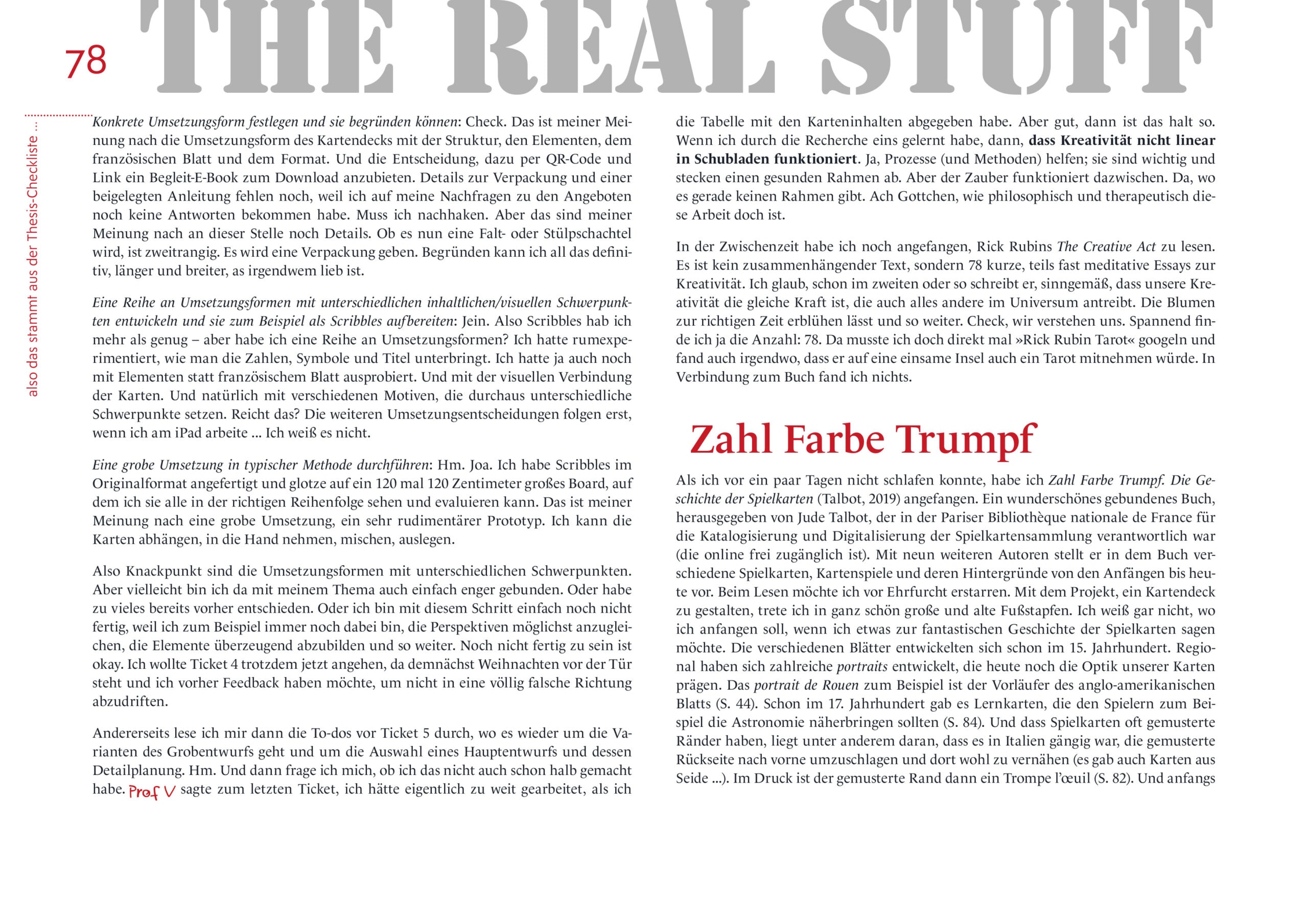
Determine a concrete form of implementation and be able to justify it: Check. In my opinion, that’s the implementation in the form of the card deck with its structure, the elements, the French suits, and the format. And the decision to offer an accompanying e-book for download via QR code and link. Details on the packaging and an included manual are still missing because I haven’t received answers to my inquiries about quotes yet. Need to follow up on that. But in my opinion, those are still just details at this point. Whether it ends up being a folding box or a rigid box is secondary. There will be packaging. I can definitely justify all of this, at far greater length than anyone would like.
Develop a series of implementation forms with different content/visual focuses and prepare them, for example, as scribbles: Yes and no. Well, I have more than enough scribbles – but do I have a series of implementation forms? I had experimented with how to fit the numbers, symbols, and titles. I had also tried it with elements instead of the French suits. And with visually connecting the cards. And of course, with various motifs that definitely set different focuses. Is that enough? The further implementation decisions will only follow once I’m working on the iPad … I don’t know.
Execute a rough implementation in a typical method: Hm. Well. I made scribbles in the original format and I’m staring at a 120 by 120 centimeter board where I can see and evaluate them all in the correct order. In my opinion, that is a rough implementation, a very rudimentary prototype. I can take the cards down, hold them in my hand, shuffle them, lay them out.
So the sticking point is the implementation forms with different focuses. But maybe I’m just more restricted with my topic. Or I already decided too much beforehand. Or maybe I’m just not done with this step yet, because, for example, I’m still trying to align the perspectives as much as possible, depict the elements convincingly, and so on. Not being finished yet is okay. I still wanted to tackle Ticket 4 now, since Christmas is coming up soon and I want feedback beforehand so I don’t drift off in a completely wrong direction.
On the other hand, I then read the to-dos for Ticket 5, which are again about the variants of the rough draft and selecting a main draft and planning its details. Hm. And then I wonder if I haven’t already half-done that too. Prof V said during the last ticket that I had actually worked too far ahead when I submitted the table with the card contents. But fine, then that’s just how it is. If I’ve learned one thing from the research, it’s that creativity isn’t linear and doesn’t fit in neat little boxes. Yes, processes (and methods) help; they are important and set a healthy framework. But the magic happens in between. Right where there is no framework. Good lord, how philosophical and therapeutic this work is.
In the meantime, I’ve also started reading Rick Rubin’s The Creative Act. It’s not one cohesive text, but rather 78 short, sometimes almost meditative essays on creativity. I think as early as the second one or so, he writes, loosely translated (first into German and now back into English again), that our creativity is the same force that drives everything else in the universe. That makes the flowers bloom at the right time and so on. Check, we’re on the same page. I find the number fascinating: 78. So of course I immediately had to google »Rick Rubin Tarot« and found somewhere that he would take a tarot deck with him to a deserted island. I didn’t find any connection to the book, though.
* Yeah, right.
** Well, that’s quoted from the Thesis Checklist …
I can’t show you much more of the first scribbles than what you see in the pic above of Borne 4 – because I trashed all the scribbles later when I had a really bad Tower Moment.
There are some more photos of it in Ticket 4, which will be published in about two weeks – if I manage to remember, I’ll link it here. Next up is a glimpse into the fabulous world of playing cards … 😍