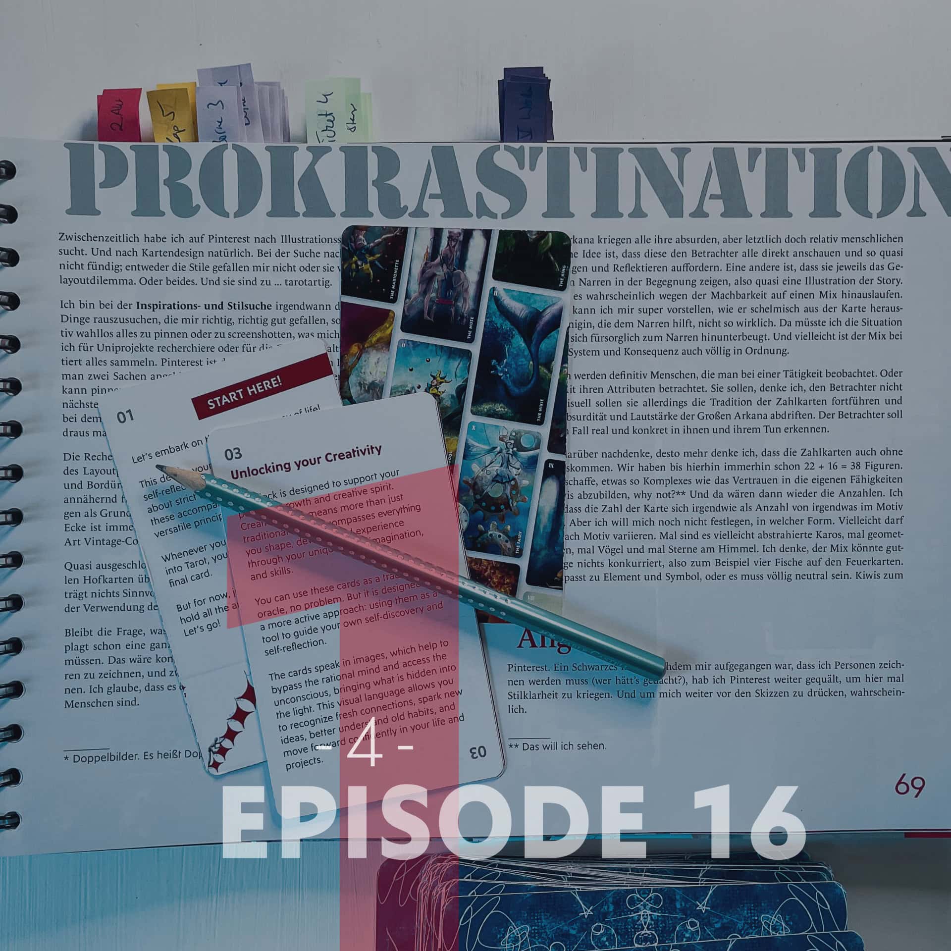
Right … After the last episode about the procrasti-research it’s definitely time for some procrasti-research. I’m browsing Pinterest, trying to find my »Style« – and still heavily avoid the scribbles and a moodboard.
Further down you’ll find the link to my original uncensored Thesis Inspo Pinterest Board with everything I’ve pinned for the Creative Tarot. 😉
Get to work, girl!
I think I’ll cut the last chapter, maybe even the last two, when I revise the documentation. Summary: I read/skimmed Creative Confidence and enthusiastically devoured the first part of Creativity. I love it. But right now, it doesn’t do much for my thesis; it’s more of a distraction. In the background, I can keep reading, soaking up, and processing information. But to actually make progress on the work, I realized last night after my reading marathon, only one thing helps: get the pens out and draw. (Edit: No, I’m leaving them in. ALL the absorbed creativity info is flowing into the work here, that’s IMPORTANT.)
So the pile of books and cards has now given way to a pile of clipboard, paper, coloured pencils, and index cards. First, I wanted to tackle the layout and the system: How can I visually represent the card’s position and suit if the Seven of Spades marking* in the corners isn’t enough for me? How can I visually connect the cards in the style of the Trojan Horse? Colourful lines running throughfrom one card to the next? Symbols of geometric shapes and elements bleeding off the edge? Colour gradients? Different numbers of lines? I agonized over it for a long time, and none of it even remotely convinced me.
Aren’t the markings in the corners maybe enough after all? But they alone bring up design questions. I’d like to colour them according to the elements instead of falling back on red and black; that looks cool, but in my opinion, it doesn’t fit the deck. So that would be roughly red-orange for Clubs, blue-green for Hearts, light blue(?) for Spades, and brown-green for Diamonds. Colors that are pretty hard to see against a colored background. So the background should be relatively white (or black). Good, because at least for the pip cards, I don’t want to colour the whole card.
* Index. The thing is called an index.
VIDEO COMING SOON!
But what then? I struggle with white borders all the way around (where the markings would then sit). I could also leave the card white and just put my illustrations in the center; so working completely without a background, or for all I care, using watercolor splashes as a background that only cover the center. I like the idea in theory, but I’m scared that I won’t get my message across clearly enough because I won’t be able to depict enough attributes, stuff. It’s basically like sculpting a statue. That one cohesive thing has to contain the entire message. I’m not Michelangelo.
The court cards, I think, should be designed following the same logic. So here too, an illustration that leaves at least the top left corner empty and allows for white space. I’ve imagined the trump cards as full-bleed and relatively loud the whole time. That fits the surreal world and the strange figures. Their Roman numeral (which I want to keep) can then be placed in white in the top left corner over the graphics; that should work.
Whether the card title, like The Harlequin or Chaos, should be on the cards, I can’t say yet. It could possibly be placed bottom center or maybe along the right edge of the card. It can be white or black; it doesn’t have to pick up the element color. Writing it down like this, I can already see it more clearly. What still isn’t working is connecting the cards visually. Maybe I just need to get that out of my head.
PROCRASTINATION
Meanwhile, I’ve been searching Pinterest for illustration styles and inspiration. And for card design, of course. My search for tarot cards yielded nothing; either I don’t like the styles, or they make my card layout dilemma worse. Or both. And they are too … tarotesque.
In search for inspiration and style, at some point, I moved away from picking out things I really, really like, and instead started out by relatively randomly pinning or screenshotting whatever somehow appealed to me. Doesn’t matter if I’m researching for university projects or for improving my garden. First, just collect everything completely unreflected. Pinterest isn’t actually my favorite tool for this; once you’ve clicked on two things, everything looks the same and above all, over-trendy. But you can pin things and then immediately see the whole board. And that’s important, because the next step is curating. Throw out everything you don’t actually like that much after all, and find the common denominator in what’s left. And then turn it into something of your own.
The research has already helped me gain a bit more confidence in solving the layout problem. Other people manage it too. Without frames and edges and borders. In one deck, the graphics just fade out so that the top left corner is virtually empty; in another, standard cards with both markings were used as a base, with the graphics layered on top. The top left corner is always sufficiently empty; the bottom right sometimes. Style-wise, it’s a sort of vintage collage—not my thing, but it works as layout inspiration.
I’ve pretty much ruled out the double, mirrored depiction that is common for standard court cards*. I had considered it at one point, but I feel it doesn’t contribute anything meaningful to the message. And the connection to real playing cards would already be more than clear enough by using the French suits.
Which leaves the question of what exactly the cards should show, and in what style. And I’ve been plagued for quite a while by the question of whether there have to be people, figures, on all the cards. It would be consistent, but firstly, I still want to dodge drawing 78 figures, and secondly, I want to keep the option open to draw other things too. I think it could be conducive to interpretation if not all the cards are full of people.
The Major Arcana are all getting their absurd, yet ultimately relatively human, creatures. One idea is that they all look directly at the viewer, essentially prompting questioning and reflection. Another is that they each show the encounter between the creature and the Fool, basically an illustration of the story. Ultimately, it will probably end up being a mix due to feasibility. I can perfectly imagine the Harlequin grinning mischievously out of the card. The Queen helping the Fool, not so much. There, I would have to show the situation, how she caringly bends down to the Fool. And maybe, despite all my love for systems and consistency, the mix is completely fine.
The court cards will definitely be people observed doing an activity. Or at least viewed with their attributes. They shouldn’t look at the viewer, I think. Visually, however, they should continue the tradition of the pip cards and not drift off into the absurdity and loudness of the Major Arcana. Ideally, the viewer should recognize themselves realistically and concretely in them and their actions.
The more I think about it, the more I think the pip cards can do without people. We already have 22 + 16 = 38 figures so far, anyway. If I manage to depict something as complex as trusting in your own abilities with five kiwis, why not?** And then there are the numbers again. I’d like the card’s number to be reflected somehow as a quantity of something in the motif. But I don’t want to commit to the exact form just yet. Maybe that can vary depending on the motif, too. Sometimes it might be abstracted diamonds, sometimes geometric shapes, sometimes birds, and sometimes stars in the sky. I think the mix could work out fine, as long as nothing clashes – like four fish on the fire cards, for example. Either it fits the element and symbol, or it has to be completely neutral. Kiwis, for example.
* Two-way court cards. They’re called two-way court cards.
** I want to see that.
Wanna check out my Pinterest Board?
Here are some very early and very late pins. You find the complete pages at the bottom in the »Original Pages« section.
Aaand: I decided to make the whole Original Thesis Inspo Board public. Wanna see what I pinned? Click here!
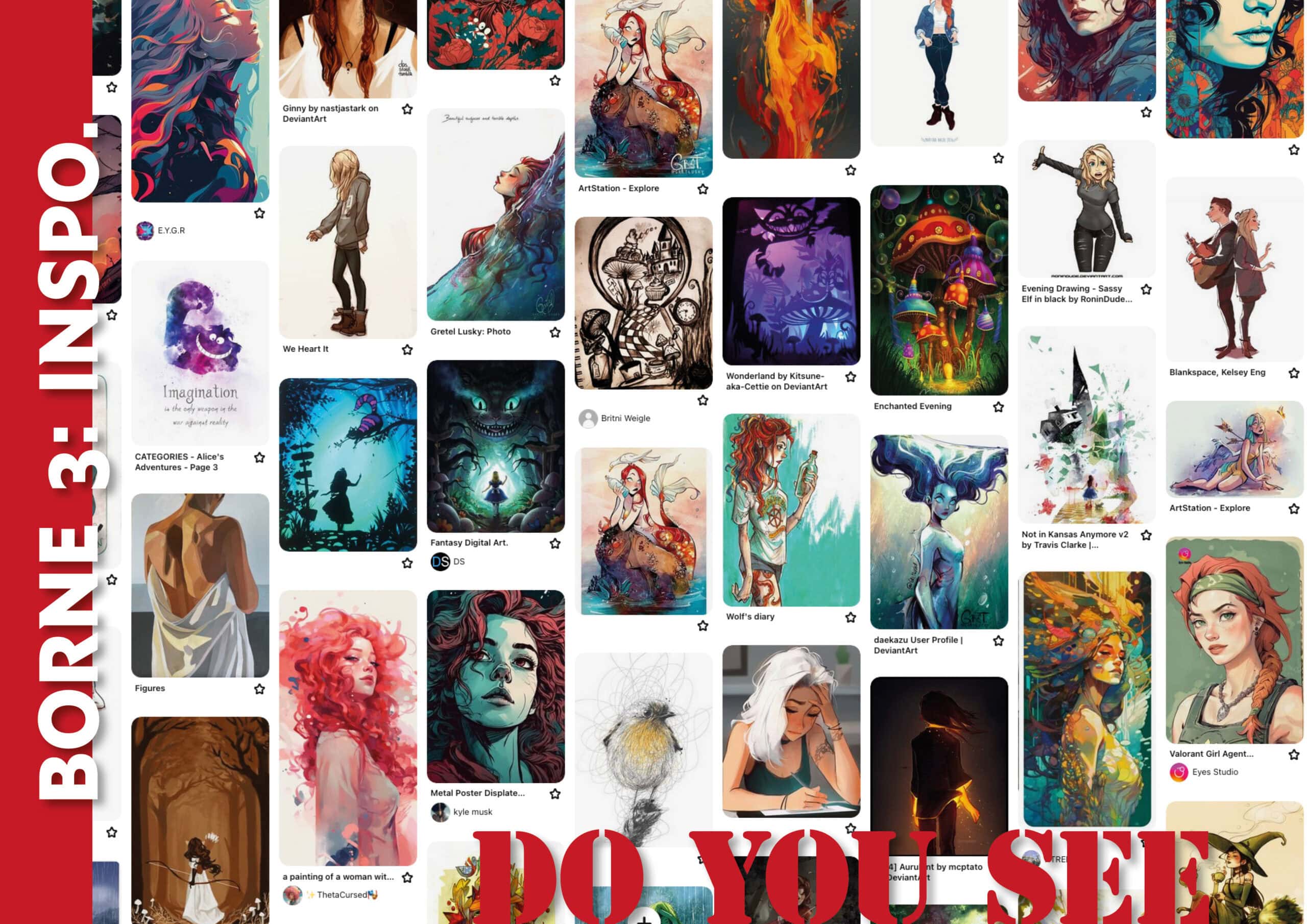
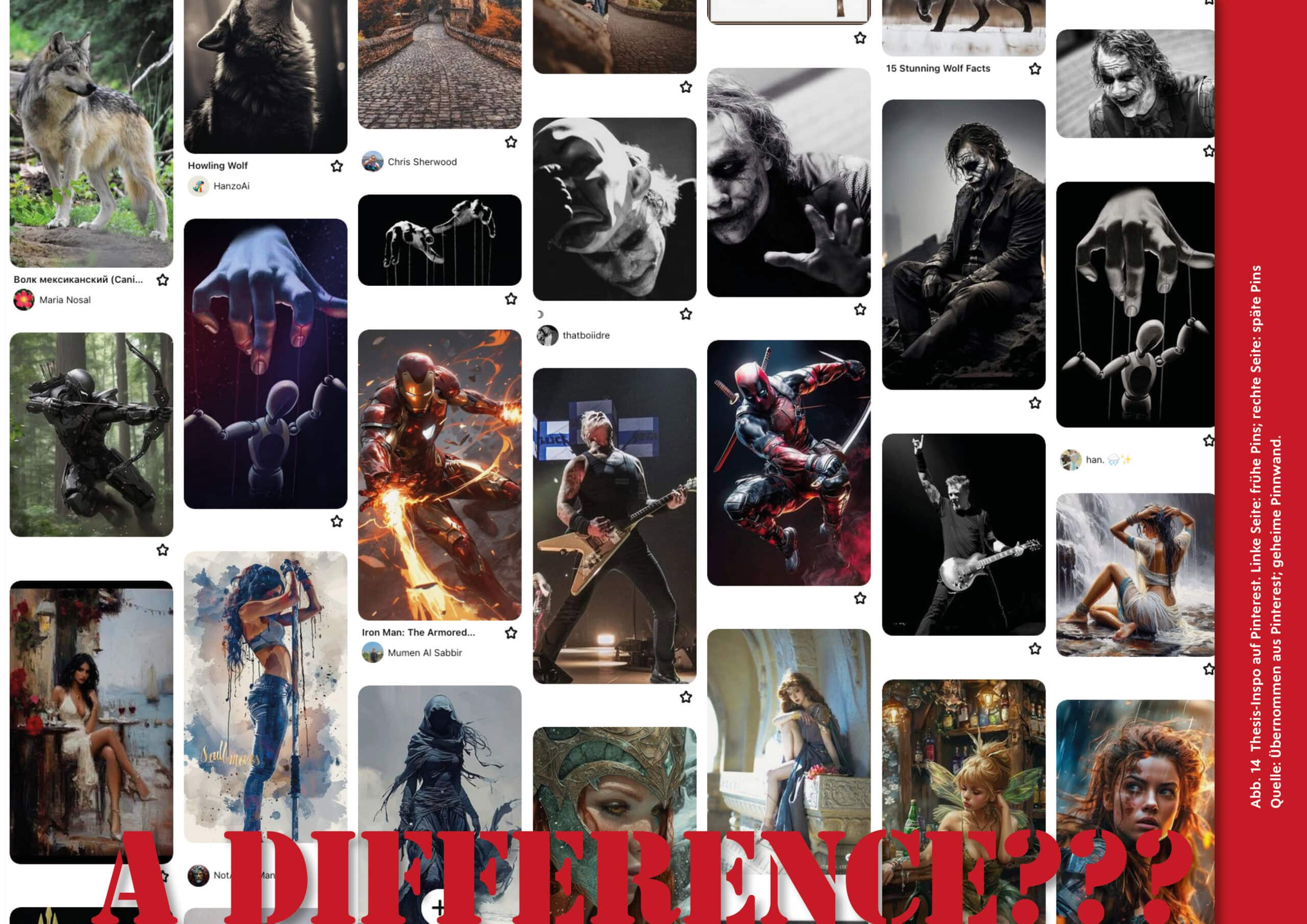
Let me know if you are the artist of any of the pins, I’d love to connect!
Fear
Pinterest. A black hole. After it dawned on me that I was going to have to draw people (who would’ve thought?), I kept torturing Pinterest to finally get some clarity on style. And probably to keep procrastinating on sketching.
Most of the figures I found look roughly like they stepped out of a Disney movie or an anime. Both stylistically and in the fact that they’re all young women (or rather girls) with anorexic tendencies. My figures shouldn’t look too simple and naive, but I also have to factor in that, first, I’m not a huge drawing pro, and second, I have a strict time limit. That restricts the level of detail quite a bit. I don’t want to draw Disney princesses, nor do I want stick figures. But no hyper-realistic portraits either; I lack the time and skills for those. And the figures somehow have to fit in with the rest of it. And this is the point where I’m seriously asking myself what the hell I’ve actually gotten myself into.
But … on Pinterest, one name kept popping up over and over: Gretel Lusky. She paints pretty cool mermaids that, for whatever reason, appeared in what felt like all of my searches. I stalked her on Instagram and googled her. Help, she’s only thirty and illustrates for Marvel and DC Comics (Lusky, 2023 b). I like a lot of her work; some things I don’t like. Overall, for me personally, it’s too loud, too poppy. But she has her own style, and that alone is something I admire. Because visually, I haven’t even remotely managed to find that yet.
For my first attempts, I think I’ll use her stuff as a guide. Having an orientation style like that helps me. It’s a starting point. While you’re looking at someone else’s specific style and content and maybe even trying to just copy-draw something, you can learn a ton. And you also figure out much more precisely what you like or don’t like about the work – and maybe even why. I find it easier to work from a concrete starting point like that and develop from there, rather than developing a mood board first and getting concrete from there.
After four years of university, I’m still completely at war with mood boards. Even privately and in other projects, I’ve tried my hand at them and never produced anything decent. In my opinion, my mood boards already look hideous and never express what I wanted to express – and what comes out in the end doesn’t have much to do with the mood board or my original vision either. I don’t know why that is. I’ve really, really tried. But just the thought of making a mood board for the deck gives me cold sweats.
That was the first confession, I guess … I’m not very good at drawing – and certainly not at painting and absolutely not when it comes to figures. And I hate mood boards. Can only lead to disaster, right?
Yes.
Let me know if you like mood boards (and how you make them, I’m too stupid) – and if you spot some pins on the board where you recognise elements from the final cards. 😉